

Therapist Website with Online Payment
EMDR California
website design
online payment integration
participation form
ABOUT THE CLIENT
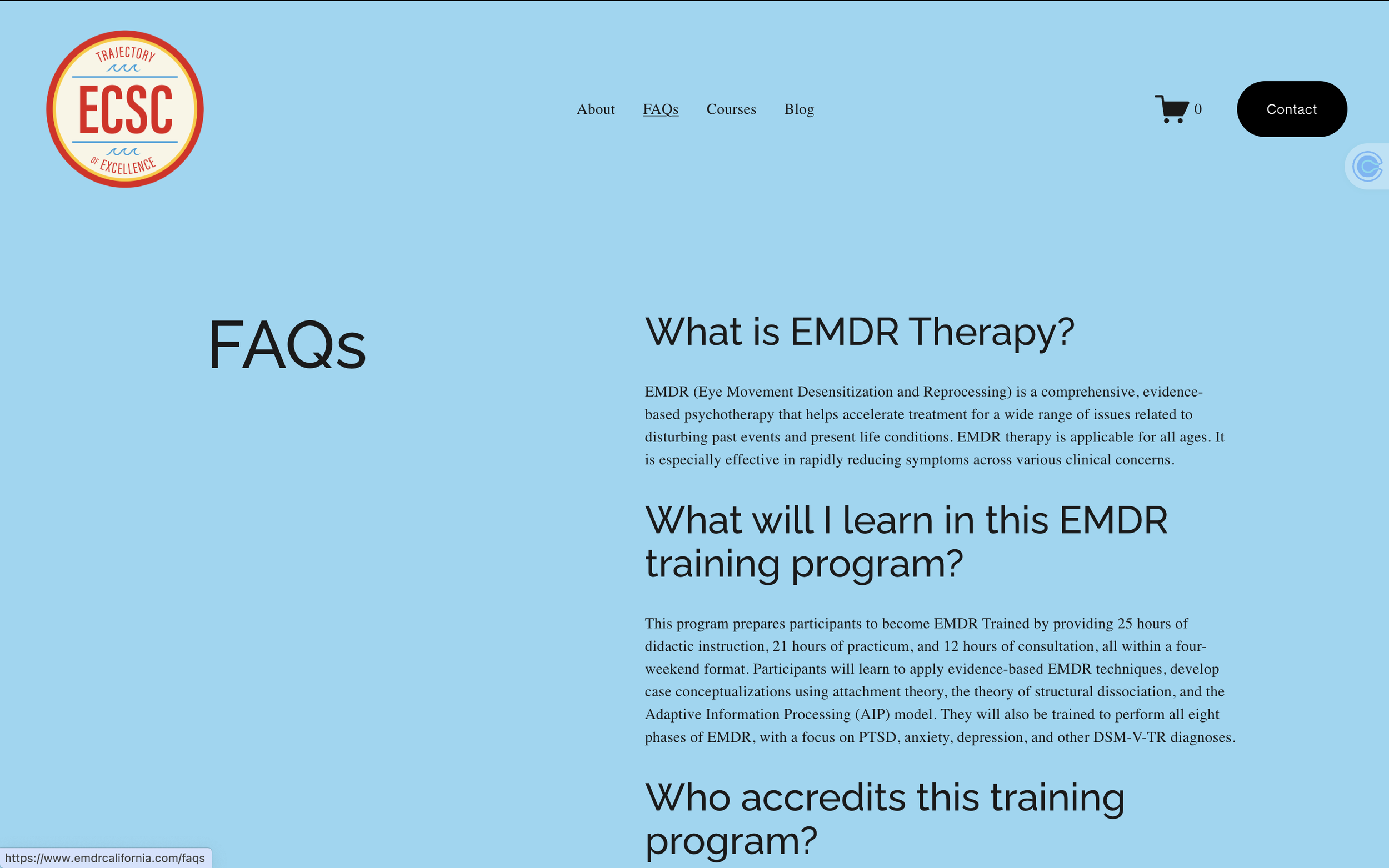
Dr. Christine Sells is a Licensed Psychologist, EMDRIA-Approved Trainer, and Founder of the EMDR Center of Southern California. She trains clinicians in advanced trauma work and runs a high-impact certification program through her website. Christine originally reached out after upgrading her Squarespace site from version 7.1 to 7.2 on her own—only to find broken links, a vanished menu bar, and a major disruption to her course registration flow. Because her clients pay several thousand dollars through the site to access EMDR training, getting things functional fast was essential. After I redesigned the homepage and stabilized the user experience, she asked me to overhaul the full site to better reflect her professionalism, streamline customer navigation, and support long-term growth.
ABOUT THE WEBSITE
Christine envisioned a site that was professional but not clinical—something that felt calming, welcoming, and rooted in the sea. She was clear about wanting a beach-inspired aesthetic to echo the tranquil, therapeutic nature of her work. We incorporated soft ocean tones and gentle movement throughout the site, creating a user experience that feels grounded and serene. Behind the scenes, we streamlined the checkout process for her EMDR training courses, adding subscription payments, installment options, and a required participation agreement. The site also includes a future-ready course section, staff bios with consultation booking, a detailed FAQ, a video testimonial section, a blog to support SEO growth, and a simple contact page. The result is a site that feels both soothing and solid—designed to build trust and make learning seamless.
***Though I helped build the site, I have no control over the daily maintenance. Once the project is out of my hands it is the responsibility of the client to maintain the aesthetic. This means that the current design of the website may or may not be reflective of the work I contributed. Please see the screenshots below for an accurate depiction of my contribution.
Website Gallery


Is your therapy business ready for a beautiful website?

Entertainment Website
Right Take Studio
website design
logo and branding
content writing
ABOUT THE CLIENT
Richard is a lifelong musician who recently invested in building a boutique recording and streaming studio as a creative side hustle to balance the intensity of his corporate job. He came to me looking for a website that would reflect the soul and authenticity of live music while also helping him attract new clients and showcase what makes Right Take Studio unique. He didn’t want something flashy or overly polished—he wanted it to feel real, approachable, and a little bit rebellious. I helped him distill the heart of his story, craft his logo, flesh out his packages, highlight his studio’s capabilities, and create a minimalist site that captures the gritty magic of live performance while making it easy for musicians to get in touch, see what equipment he has, book time, and stream to the world.
ABOUT THE WEBSITE
For the design of the website, Richard wanted something that felt creative, down-to-earth, and true to the live music experience—nothing too slick or sterile. The studio itself is filled with carefully chosen gear and has a warm, gritty vibe, so I made sure the site reflected that same sense of character and honesty. The main goal was to create a simple but impactful one-page site where bands and solo artists could quickly understand what the studio offers, watch sample videos, and easily reach out to book a session. We also highlighted the studio’s live-streaming capabilities and Richard’s mission to support emerging artists, making the site both a calling card and a tool for connection.
***Though I helped build the site, I have no control over the daily maintenance. Once the project is out of my hands it is the responsibility of the client to maintain the aesthetic. This means that the current design of the website may or may not be reflective of the work I contributed. Please see the screenshots below for an accurate depiction of my contribution.
Website Gallery


Is your creative business ready for a beautiful website?

Brick and Mortar Website
Polsterwerkstatt M
website design
client quote contact form
dual language
ABOUT THE CLIENT
John had an upholstery shop in Berlin for many years and relied on getting new business through referrals which mostly worked, but when Covid hit, he realized he needed to up his digital game. He didn’t consider himself the type of person to put himself or what he does out in public but I assured him that I would design a website that matched his aesthetic and simultaneously increased organic traffic to his workshop. I helped him organize the most important aspects of his business to showcase as well as create a minimalist dual-language website. As a US expat living in Berlin, John wanted to make sure his site was available in German and English in order to be more inclusive.
ABOUT THE WEBSITE
For the design of the website, John wanted a place where clients could submit proposals for upholstery projects as well as see a gallery of past work. He wanted the design to be minimalist yet also high-end. At the same time, his brick-and-mortar shop and workshop has a cozy and approachable vibe so I wanted to make sure the site had the sam relatable and inclusive vibe. The main focus of the site was to provide a place where German and International clients could learn more about the workshop offerings, contact the shop directly for a quote, and see a gallery of past projects.
***Though I helped build the site, I have no control over the daily maintenance. Once the project is out of my hands it is the responsibility of the client to maintain the aesthetic. This means that the current design of the website may or may not be reflective of the work I contributed. Please see the screenshots below for an accurate depiction of my contribution.
Website Gallery


Is your brick and mortar small business ready for a beautiful website?

Healer Website
AMACURA
website design
content clarity
ABOUT THE CLIENT
Valeria, the founder of Amacura, combines different massage techniques and healing modalities to promote deep healing. When I first began working with Valeria, she already had a logo and social media presence but no website presence. I helped her bring clarity to her offerings as well as create a minimalist dual-language website that would incorporate her two favorite Italian words; amare, which means to love, and cuare which means to heal. Combined, they are Amacura.
ABOUT THE WEBSITE
For the design of the website, I wanted to make sure that it was easy to navigate and that it also conveyed a calming essence. I made the bold choice to make all of her hyperlinks red in order to accent the amare (love). The main focus of the site was to provide a place where potential clients can learn more about her offerings and contact her for appointments.
***Though I helped build the site, I have no control over the daily maintenance. Once the project is out of my hands it is the responsibility of the client to maintain the aesthetic. This means that the current design of the website may or may not be reflective of the work I contributed. Please see the screenshots below for an accurate depiction of my contribution.
Website Gallery


